By Eugen Eşanu
Designer at Laroche.co and host of Laroche.fm | More on eugenesanu.com
Jun 29
Ttranslator:Alexi
The saying that “good design is obvious” is pretty damn old, and I am sure it took different shapes in the previous centuries. It referred to good food, music, architecture, clothes, philosophy and everything else.
俗话说:“好的设计是明显的”,这种说法真是老掉牙,我可以肯定在早些时代有不同的方式。它包含:食品、音乐、建筑、服装、哲学和其他一切。
We forget that human mind changes very slow, and the knowledge you have about human behaviour will not go old for at least 50 years or so. To make it easy for you, we need to keep consistent with a couple of principles that will remind us of how to design great products. We should be told at least once a month about these small principles until we live and breathe good design.
我们忽略了人类心智发展缓慢,并且你对人类行为习惯的知识过去50年或更久都没有过时。我们需要坚定两个原则,这两个原则提示我们如何更容易的设计伟大产品。在我们生活和呼吸良好的设计之前,至少应该每个月告诉我们一次这些小原则。
The human brain’s capacity doesn’t change from one year to the next, so the insights from studying human behaviour have a very long shelf life. What was difficult for user twenty years ago continues to be difficult today — J. Nielsen
人类的脑容量每年都没有变化,因此对人类行为学习的洞察力有一个长久的保质期。20年前和今天对于用户来讲一样困难—— J. Nielsen
Revisiting: Don’t Make Me Think(重拾:不要让我思考)
Steve Krug laid out some useful principles back in 2000, after the dot-com boom which are still valuable and relevant nowadays. Even after his revised version, nothing changed. Yes, you will tell me that the looks are more modern and the websites are more organised and advanced (no more flash!). But what I mean about that is — nothing has changed in human behaviour. We will always want the principle “don’t make me think” applied to any type of product we interact (whether it is a microwave, tv, smartphone or car).
回到2000年,Steve Krug提出了一些有用的原则,在网络兴旺发展之后同样适用并至今有关。甚至在他修改版本之后依然没有变化。是的,你会说这个看上去很现代并且网站技术更有组织性和先进性(并未含flash)。但是我的意思是:人类的行为习惯并没有变化。我们需要始终遵循原则:“不要让我思考”,并应用在任何种类我们使用交互的产品上(不管它是微波炉、电视、电话或者汽车)。
1. We don’t read, we scan(我们不读,我们浏览)
The reason for that is — we are on a mission, and we only look for the thing that interests us. For example, I rarely remember myself going through all the text on the homepage of a product website. Why? Because most of the web users are trying to get something done, and done quickly. We do not have time to read more than necessary. And we still put a lot of text because we think people need to know that. Or as some designers say: “it adds to the experience”.
理由是——我们带着使命的,我们只寻找我们感兴趣的东西。比如,我很少记得我浏览的主页文本在一个产品网站上。为什么呢?因为大部分网站使用者都试着完成一件事,并且快速完成。我们没有必要花时间读更多的东西,但是我们依旧放很多文本因为我们觉得人们需要去知道这些。或者像某些设计者说:“这样增加体验。”
Use plenty of headings — they tell you what each section is about or if they are relevant to the person. Either way, they help you decide to scan further or leave the website.
使用大量标题——他们能告诉你每一个区域如果能关联到用户。换个说法,他们帮助你决定是否浏览更久还是离开网站。Keep paragraphs short — long paragraphs makes it harder for readers to keep their place, and they are harder to scan than a series of short paragraphs. There’s always a reasonable place in a paragraphs to break it in two.
让段落保持短小——长的段落让阅读中很难保持阅读位置,并且比短小的段落更难浏览。总有理由让一段话分为两段。Use bulleted lists — almost anything can be a bullet list. Do you have a sentence that separates many things with comma? Then it can be a bullet list. Also, don’t forget to leave space between bullet list rows for optimal reading. Take Medium as an example.
使用伸缩列表——大部分的内容可以纳入伸缩列表。你有一个用逗号隔开的很多内容的句子吗?那么可以变成伸缩列表。同时,不要忘了为方便阅读在每一表格之间空格。把这种方式当成一个模块。Highlight key terms — much of page scanning process consists of looking for keywords and phrases. Formatting the most important one in bold, makes them easier to find. Also, don’t highlight too many things because it will lose effectiveness.
高亮关键词组——大部分的页面浏览过程包含寻找关键词和词组。最重要的用加粗格式,让他们便于找到。同样,不要强调太多内容,这样会失去效果。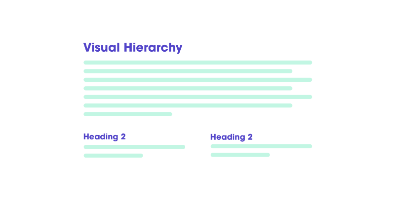
2. Create effective visual hierarchies(创造有效的视觉层次结构)
Another important aspect that will help scanning a page is offering a proper visual hierarchy. We have to make it clear that the appearance on a page portrays the relationship between elements. So there are a couple of principles for that:
帮助浏览页面的另一个重要方面是提供一个合适的视觉层次。我们必须确保页面上的显示能清晰描述各元素之间的关系。因此有以下两个原则:
The more important something is, the more prominent it is. The most important stuff are either larger or bolder in distinctive colour set.
越重要的信息越需要突出。最重要的材料要么放大要么加粗,用与众不同的颜色设置。Things that are related logically, are related visually. For example things are similar by grouping them under the same visual style, or under the same heading.
事情要被描述的有逻辑、可视化。比如事件相似的要打包并使用同一种视觉风格,或者有相同的开头。
3. Don’t reinvent the wheel(不要标新立异)
We believe that people want something new and more. But we forget that there are so many applications on the market that each demands our time. Each of them has different interactions, and we need to learn each one of them. And our mind blows up when: “Oh man, another app to learn?!”.
我们相信人们想要新的更好的东西。但是我们也忘了依然有很多市场上的应用占据我们的时间。他们每一个都有不同的交互,因此我们需要学习每一种。我们大脑这个时候炸了:“老兄,又一个软件要学?!”
It is an important point to know before I am going to say this:
在我讲这一点前需要强调一点:
We as designers, when asked to design something new, have a temptation to try and reinvent the wheel. Because doing something like everyone else seems somehow wrong. We have been hired to do something different. Not to mention that the industry rarely offers awards and praises for designing something that has “the best use of conventions”.
我们做为设计师,当被喊着去设计一些新东西时,会有尝试重新发明轮子的诱惑。因为做一些和平常人一样的事情貌似是不对的。我们被雇佣是因为我们能做不同。更不用说,行业很难奖励和赞赏那些“最佳使用惯例”的产品。
Before reinventing the wheel, you have to understand the value (time, effort, knowledge) that went into what you are trying to disrupt and innovate.
在重新造轮子前,你必须理解你接近试图颠覆和变革东西的价值(时间、成就、知识)。
4. Product instructions must die(产品说明会灭亡)
Our job is to make stuff clear and obvious. If obvious is not an option, then at least self-explanatory. The main thing you need to know about instructions is that nobody is going to read them. We should aim for removing the instructions to make everything self-explanatory. But when they are necessary, cut as much as possible. (but, really, nobody is going to read them). We muddle through.
我们的工作是让材料清晰和明显。如果显而易见不是选择,那么至少一目了然。你需要知道的主要是没有人会去阅读说明。我们打算消除说明让一起一目了然。但是当说明必须要时,尽可能删减。(但是,事实是,没人大叔阅读他们)。我们蒙混过关。
If it is not obvious then we should aim for self-explanatory.如果不显而易见我们就打算一目了然。
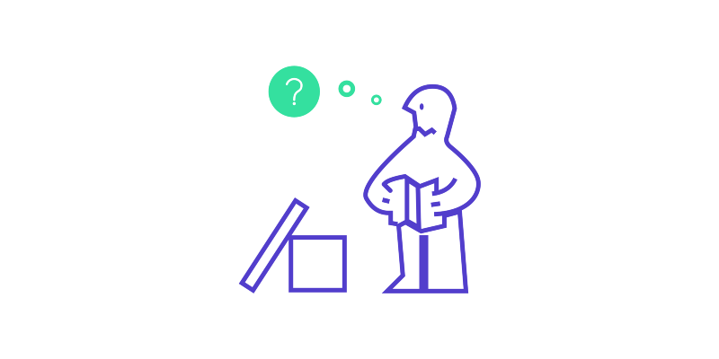
Take IKEA as an example. If you gave an average person to assemble a wardrobe from IKEA, I am sure that he will assemble it right most of the times. Why? It is, most of the cases, apparent on how it should be assembled if we have a clear picture in front of us. But even in instances where they look at the instructions, there are no words — only images.
拿宜家举个例子,如果你给普通人一个可安装的宜家衣柜,我可以保证他大多数时候能够安装正确。为什么?显然如果我们有一张清晰的安装图在面前,我们大多数时候就能安装它。甚至事实上他们看的说明没有一个字,都是图。
5. We do not care how your product works(我们不关心你的产品怎么工作)
For most of the people, it is not essential to know or understand how your product works. Not because they are not intelligent, but merely because they do not care. So once they nail down the use of your product, they will rarely switch to something else.
对大多数人来说,没必要知道或理解你产品工作。不是因为他们不聪明,而是仅仅他们不关心。所以他们一旦固定使用你的产品,那么他们很难转移到其他产品上。
Let’s take as an example the Apple AirPods. We can all admit that they are the worst sounding earbuds for the price you pay. But when I look at how people interact with it, I understand the real reason why they buy it. They do not make you think about why it is not working. You even don’t notice they have new technology.
让我们把苹果的AirPods当成例子。我们能完全承认这是这个价位你能买到的最差音质耳塞。但是当我看见人们如何与它交互时,我理解了人们买它的真正原因。他们不会让你思考为什么耳机没有工作。你甚至没有注意到他们蕴含的新科技。
I look at how my mom interacts with them, and she never asked me what technology is behind or how they work. She knows that whenever you open the case near your device, it is going to connect. It is that easy.
我观察我的母亲是如何与他们交互,她从来没有问过我背后的科技或者如何让他们工作。她知道无论什么时候在设备旁边打开盒子,它就会去链接。这真简单。

6. People don’t look for “subtle cues” — we are in a hurry(人们不会寻找“微妙的线索”——我们很忙)
My favourite one. We, designers, love giving the users subtle effects and add beautiful delights. Right? Well, what if I told you that your users don’t care about it? No matter how much they tell you they do, they don’t. First time? Yes. Second? Ok. Third? Really, how much do I have to see this until it’s enough?
我最喜欢的一点,我们设计师喜欢给用户微妙的效果和增加美丽的喜悦。这样对吗?如果我告诉你用户一点也不关心这些?无论如何他们告诉你他如何做了多少次,他们都不会喜欢。第一次?好的,第二次?行,第三次?说句实话,我到底要看多少次这个部分才足够?
Why is this happening? Life is a much more stressful and demanding environment than an app’s delights and subtle effects. For example, you are a father, and your kid is screaming because he wants ice cream, the dog is barking because somebody is calling at the front door and you are trying to book a quick train ticket that should leave in 40 minutes. In that specific moment, people will not give a f* about your subtle cues. On the other side, we should use them, but not when it kills the user flow.
为什么会发生?生存比app带来的趣味和微妙影响更多的是压力和苛刻的环境。比如,你是一位父亲,你的孩子因为想要冰淇淋而尖叫,你的狗狂吠因为有人在家门口打招呼,你试着订一张火车票因为你40分钟就要离开。在这个特别的时刻,人们才不会XXX关心你的微妙细节。换句话说,我们只要使用,而不是消磨使用者的耐心。
7. Focus groups are not usability tests(焦点小组并不是有效的测试)
Focus group is a small group of people that sit around at the table and discuss things. They talk about their opinions about the product, past experiences, their feelings and reactions to new concepts. Focus groups are great for determining what your audience wants.
焦点小组是指一小波人坐在桌子边讨论事情。他们讨论对产品的想法,过往的经验,他们的感受以及新接受的理念。焦点小组最大决定了你的用户想要什么。
A usability test is about watching one person at a time trying to use something (your product in this case). In this case, you ask them to perform specific actions to see if you need to fix something in your concepts. So focus groups is about listening and usability tests are about watching.
一个有效的测试是关于一个人在一段时间内做某些事情(你的产品就在这个事件中)。在这个事件中,你要求他们执行专业的操作,查看是否有你需要在理念上修复改进的地方。因此焦点小组是关于倾听的,有小测试是关于细致观察的。
8. We allow personal feelings take over the process(我们允许个人情感大于流程)
All of us who design digital products have the moment when they say — “I am a user too, so I know what is good or bad.” And because of that, we tend to have strong feelings about what we like and don’t.
我们设计数字产品的设计师会有时候说:“我也是名用户,我知道什么是好坏。”因为这个,我们倾向于对什么喜欢、什么不喜欢有强烈的感受。
We enjoy using products with __, or we think that _ is a big pain. And when we work on a team it tends to be hard to check those feelings at the door. The result is a room full of people with strong personal feelings on what it takes to design a great product. We tend to think that most of the users are like us.
我们享受使用产品的??,或者我们认为??是一个大痛点。当我们在团队工作时我们往往很难找到这些感觉的门路。结果是一个房间里充斥着强烈的个人情感去设计伟大的产品。我们往往思考大多数用户和我们一样。
9. You ask the wrong questions(你问了错误的问题)
It is not productive and will not add any value if you ask questions such as: “Do people like drop-down menus?”. The right question to ask is: “Does this drop-down menu, with these words, in this context, on this page create a good experience for people who are likely to use the site?”
如果你问了比如:“人们喜欢下拉菜单吗?”,这是没有建设性和有增加价值的问题。正确的问法是:“这里用这些词在这个页面和上下文中创造下拉菜单,是否为使用这个网站的用户带来好的体验?”
We should leave aside “do people like it?” and get deeper into the strategic context of design.
我们要远离提出“用户会喜欢?”,并且深入理解设计上的战略联系。
The reason for that is if we focus on what people like, we will lose focus and energy. Usability testing will erase any “likes” and show you what needs to be done.
原因是如果我们集中精力在用户喜欢啥,我们会损失注意力和精力。有效的测试应该避免任何“喜好”并且展示你需要做的事情。
10. When a person uses your product, you forget that she shouldn’t spend time thinking about…(当一个人用你的产品,你别忘了他们不会花时间想…)
Where am I?
我在哪?Where should I begin?
我该从哪开始?Where the f* did they put _ ?
他们到底XX放哪?What are the most important things on this page?
这个页面最重要的东西是什么?Why did they call it that way?
他们为什么这么称呼它?Is that an ad or part of the site?
这是广告还是网站的一部分?
The point is that every question that pops into our head, when using your product, only adds up to the cognitive workload. It distracts our attention from “why I am here” and “what I need to do”. And as a rule, people don’t enjoy solving puzzles when they merely want to know if that button is clickable or not.
要点是当用你的产品时,这些问题从脑袋里爆炸出来只会增加认知负担。它会转移我们的注意力从“我为什么在这”到“我需要做什么”。一个准则,人们不乐于解决麻烦事像是仅仅理解这个按钮是可点的还是不能。
And every time you make a user tap on something that does not work, or it looks like a button/link but it’s not, it also adds up to the pile of questions. And this happens because who built the product did not care too much about the product.
每个时刻你让用户点击什么东西但是它没有工作,或者看上去像个按钮和链接但其实不是,这样也会增加大量的问题。这种问题的发生是因为做产品的人没有真正关心产品。
One more thing
I host a design podcast, Laroche.fm, and I would appreciate if you could give it a listen. Also, clapping lets me know that you have enjoyed reading this post and also allows others to see it. Also, I always appreciate your comments too.

 买杯咖啡钱~